ShopDreamUp AI ArtDreamUp
Deviation Actions

Suggested Deviants


Suggested Collections


Comments30
Join the community to add your comment. Already a deviant? Log In
no boobs = no critiques? Haha, I'll write you one, because this deserves it.
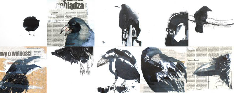
Vision and originality:
Interesting vision and concept, although without context it is a bit hard to judge. Definitely original!
Technique:
Very good! I'm especially fond of nr 3 & 4 of the top, and nr 1, 4, 5 on the bottom row. Simple, but at the same time strong forms, confident strokes.
(A small nitpick: while all the others apparently shows Ravens [Corvus corax], nr 3 on the top row actually looks much more like a rook [Corvus frugilegus]! And as I understand "Kruku" is Polish for Raven)
I am less fond of nr 2 & 5 on the top, and nr3 on the bottom. they dont have the same confidence and strength, and detracts somewhat from the overall impact of the piece.
The ripped newspaper pages gives something of a human touch and context to it, and without it this would be "just" a nice series of well painted Ravens (and a Rook). The newspaper makes me think that you wanted to say something, make a comment or make the viewer reflect and think about their reaction to different picture-boxes.
But overall very good, the technique is the strongest aspect of this piece in my view.
Composition and colour:
The amount of individual "boxes" makes it a bit messy and unfocused, it takes too long to take in the whole piece, and sadly lessens the impact. Maybe having just 4 or at the most 6 different boxes (of which I personally would like nr 4 top, and 1, 4, 5 bottom <img src="e.deviantart.net/emoticons/w/w…" width="15" height="15" alt="
Colour wise its excellent! The old yellow stained newspaper backdrop contrasts very nice with the muted blues and greys.
Impact:
The bold, simple black shapes that are well executed gives a strong impact. But the small size of the image file (maybe it looks much better at a larger size?) and the amount of "boxes" lessens the impact. In my humble opinion it would be better off with fewer boxes and at a larger file size.
Comments:
Not much more I can say, very good, just a few minor things that I personally think would improve it. The colour, composition, technique and execution shows real effort, thought and skill.
Well done!